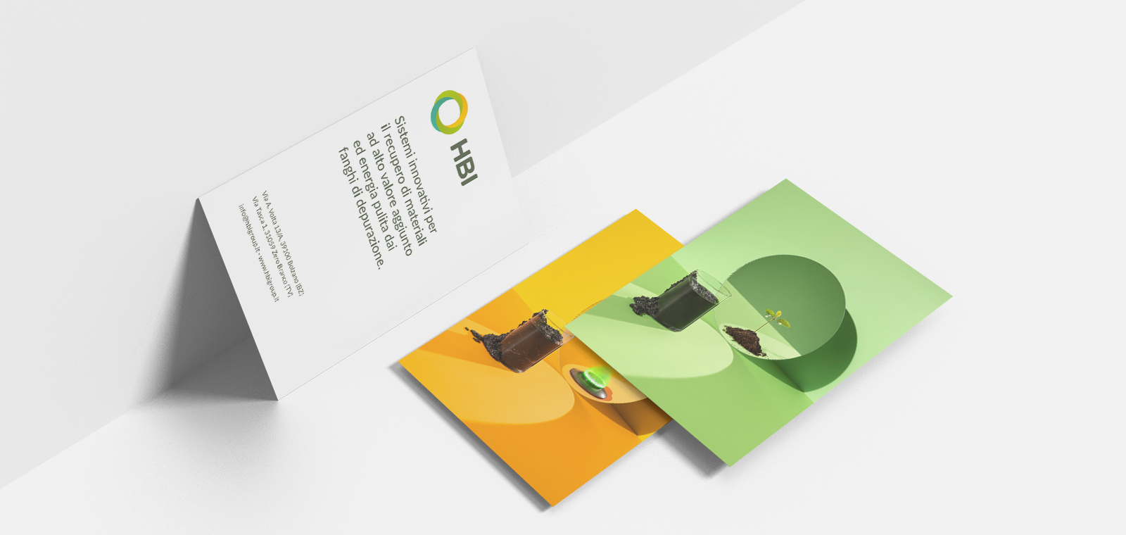
The Branding Behind HBI
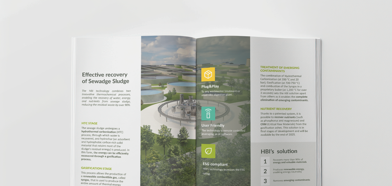
For HBI, I developed a branding system that visually conveys the company’s pioneering approach to sustainability and innovation. At the core of HBI’s identity is a polygenerative technology, patented to treat wastewater sludge through a circular approach. This system not only recovers resources but also generates clean, renewable energy, making it entirely energy self-sufficient.
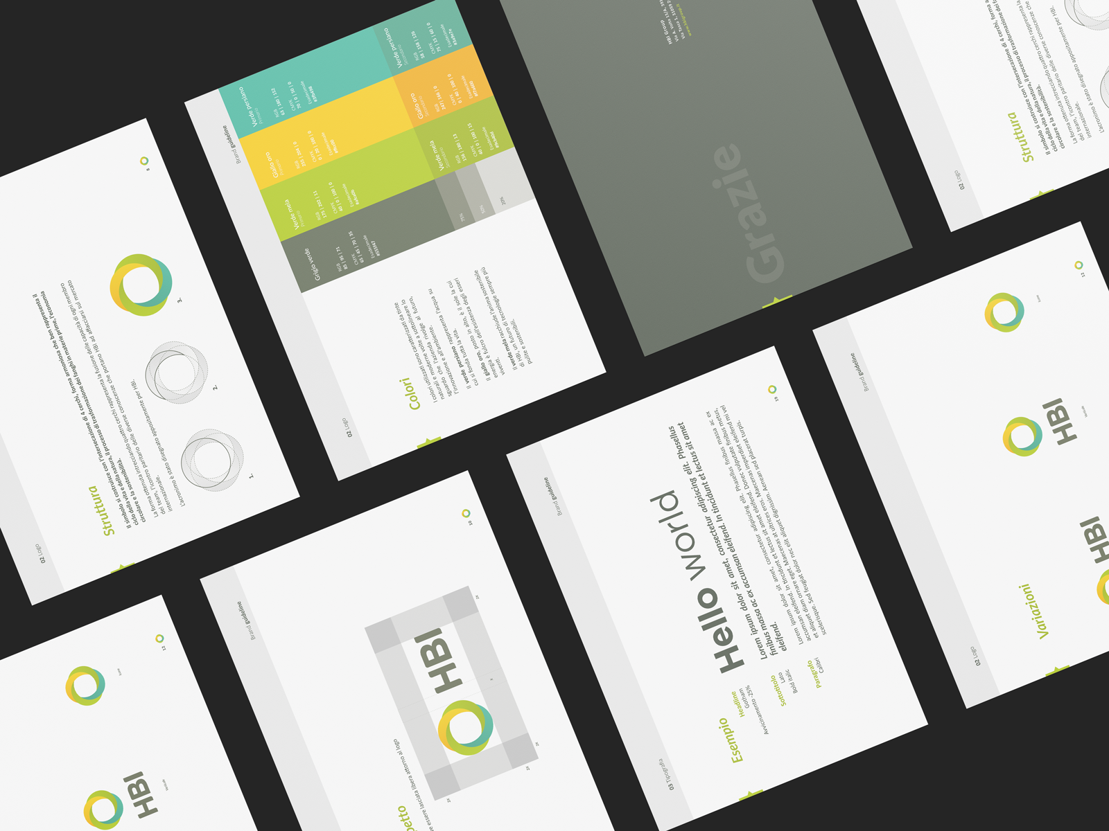
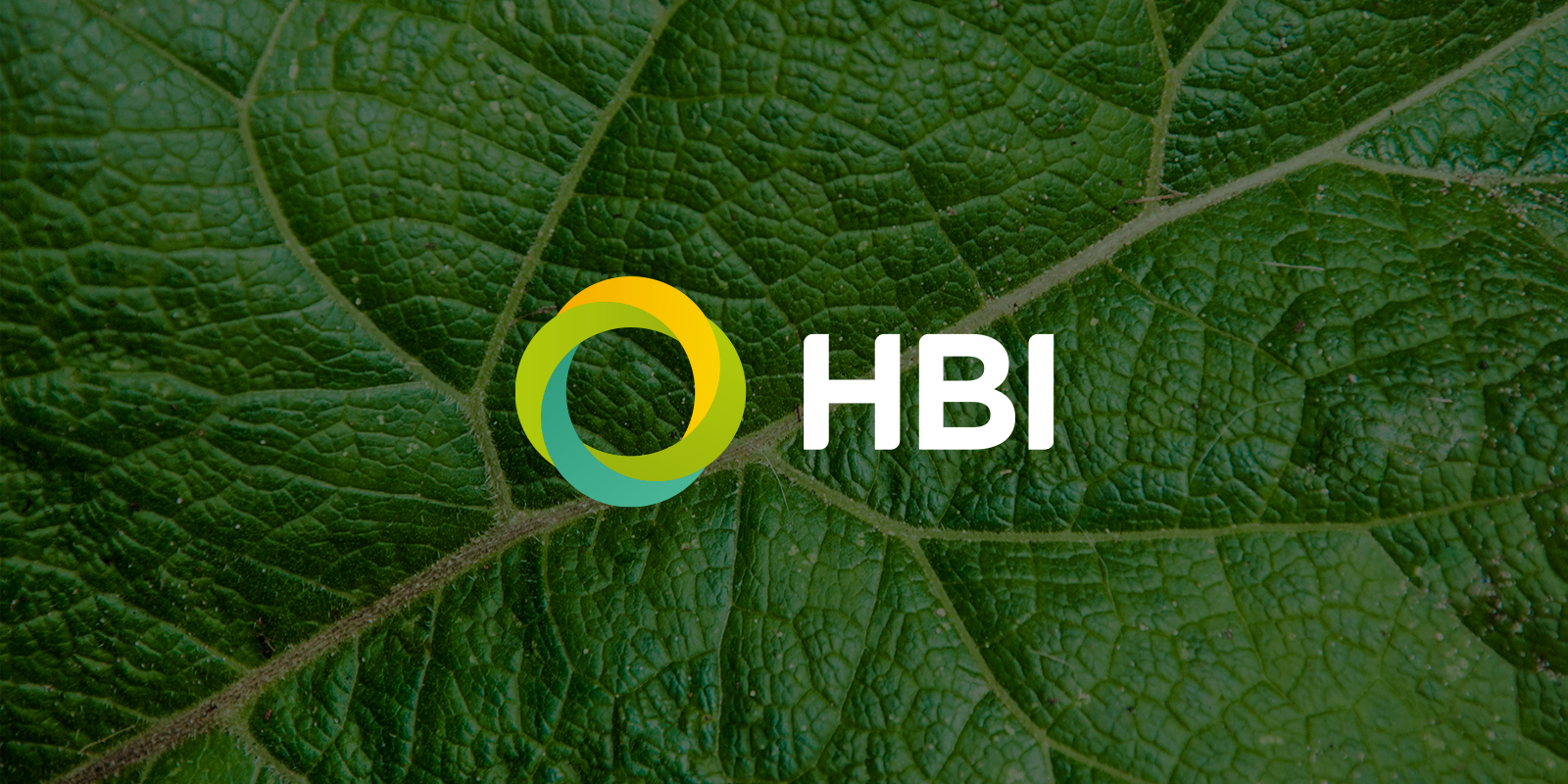
The logo embodies HBI’s commitment to environmentally responsible technologies that improve our quality of life while securing a sustainable future. Designed using the intersection of four circles, the symbol represents:
- The cycle of life and nature,
- The transformation of sludge into raw materials,
- The principles of circular economy and sustainability,
- The synergy of diverse expertise within the team.
This interconnected form visually reinforces HBI’s ability to balance technology, knowledge, and innovation, allowing the brand to establish a strong presence in the international market.
To strengthen HBI’s unique identity, I crafted a custom typographic design for the acronym, ensuring it communicates the brand’s distinctiveness and vision. The result is a branding system that is not only cohesive and strategic but also aligned with the company’s mission to shape a more sustainable future.