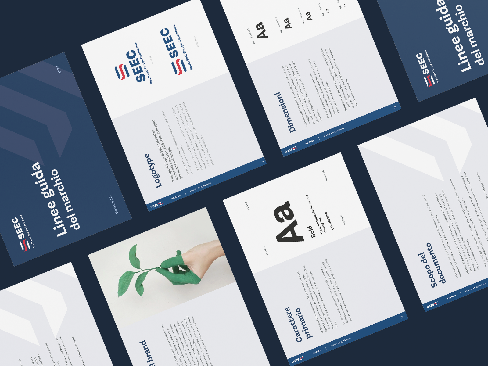
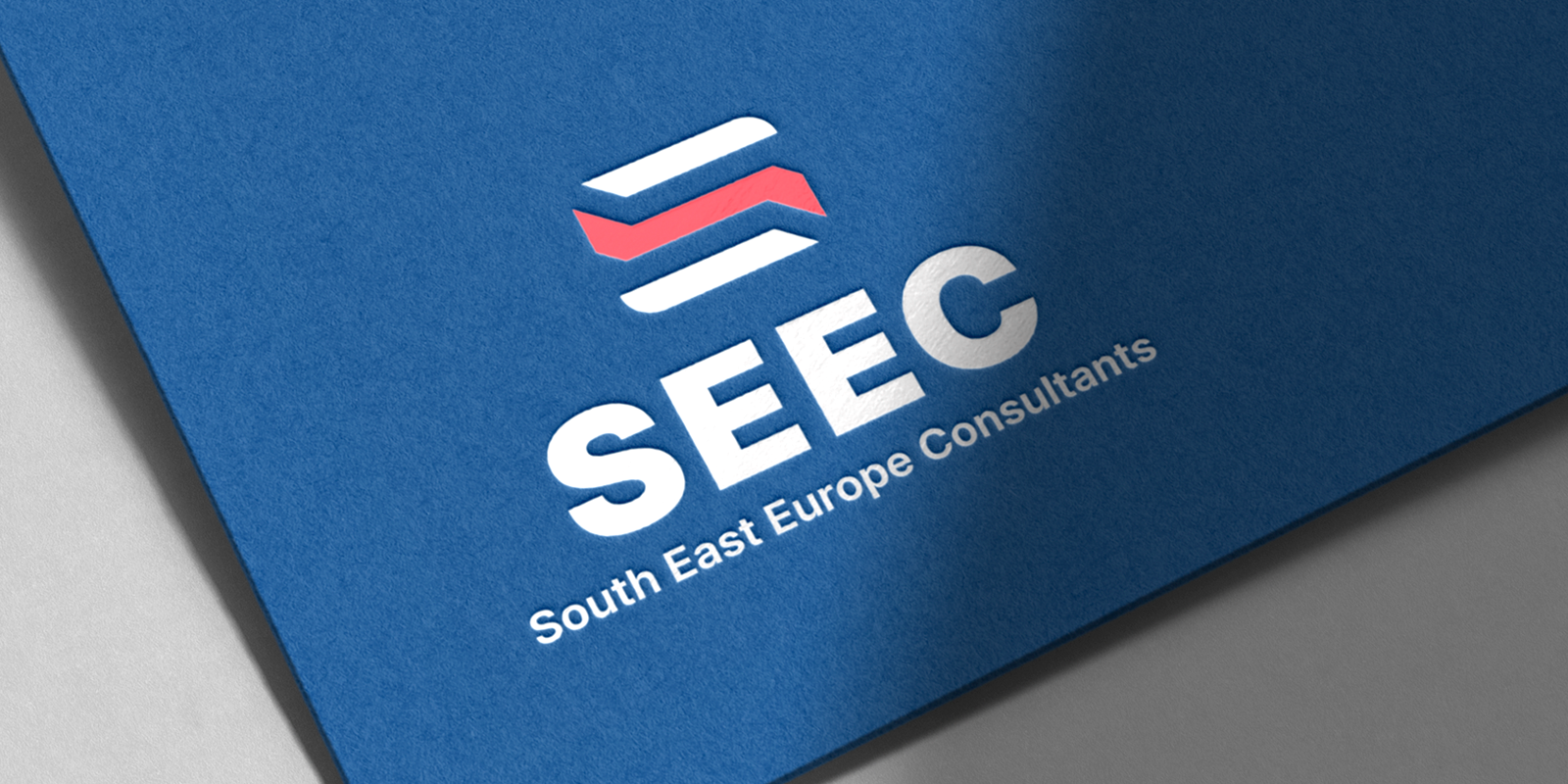
SEEC’s visual identity: modernity, boldness, and innovation
For SEEC, I developed a visual identity that reflects its leadership in energy consulting, combining modernity, boldness, and long-term vision.
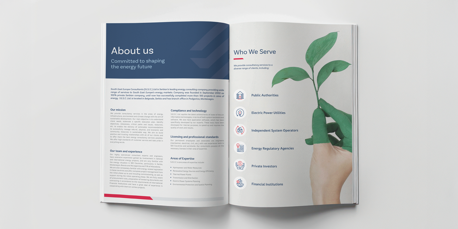
Founded in 2002 in Belgrade, Serbia, South East Europe Consultants (S.E.E.C.) Ltd. is a leading consultancy in energy, infrastructure, environment, and climate change across Southeast Europe. With over 100 completed projects, SEEC supports public authorities, energy entities, private investors, and international financial institutions, providing integrated solutions and full support from the initial project phase to commissioning.
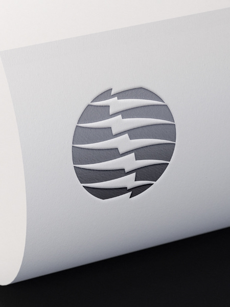
The SEEC logo was designed to convey modernity and boldness, with a concept built to stand the test of time. Its visual identity combines clean geometric lines, representing a modern and essential design.
A distinctive feature of the logo is the integration of simple shapes that echo the letter "S" from SEEC, maintaining a strong visual connection to the company's name. This element gives the brand a technological and professional look, perfectly suited to a dynamic and innovative energy sector.
To further reinforce the brand’s identity, I developed a custom typographic design, ensuring a strong, strategic visual impact. The result is a cohesive, distinctive, and future-oriented branding system that strengthens SEEC’s position as a reliable partner in the energy transition across Southeast Europe.